The Law of Proximity in Behavioural Web Design

- Published on
The Law of Proximity in Behavioural Web Design
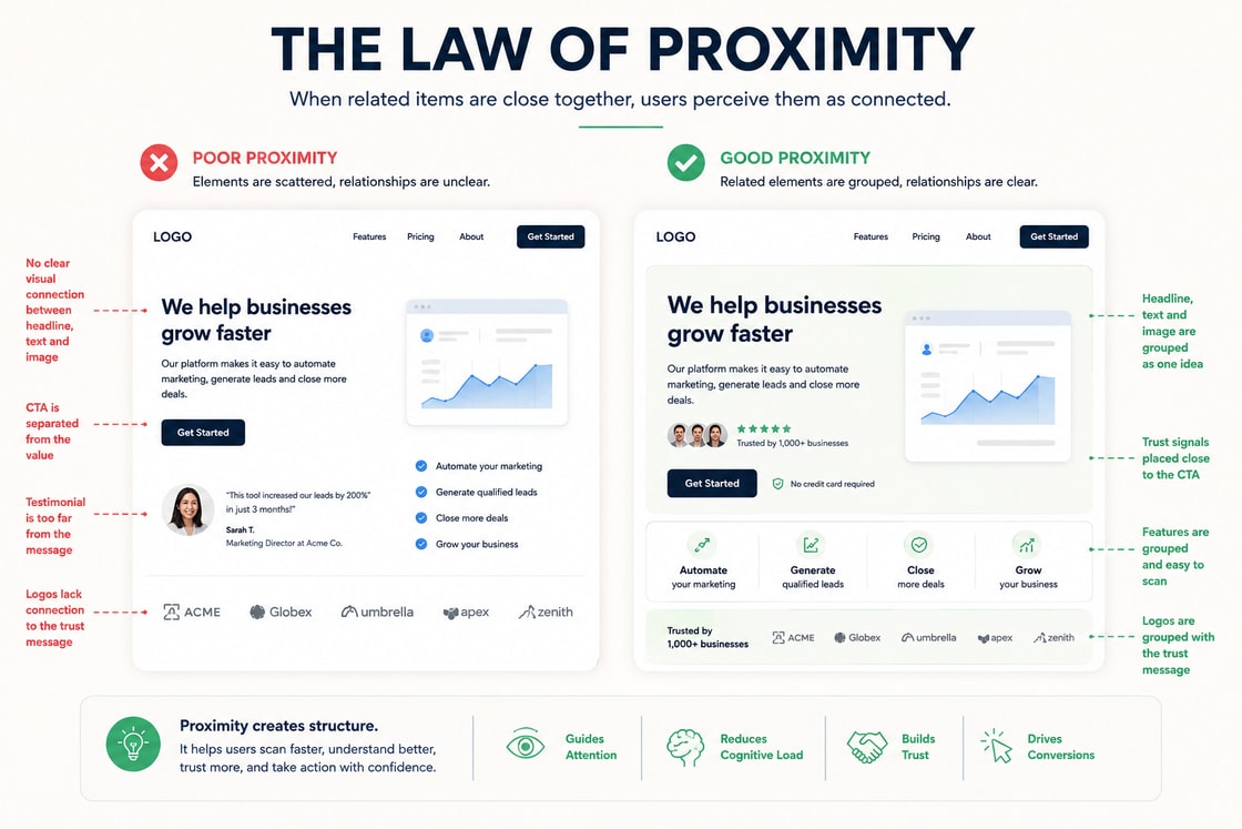
The Law of Proximity is one of the most practical principles in behavioural web design. It explains why users naturally assume that things placed close together are connected. On a website, that assumption affects how people scan a page, how quickly they understand the offer, how much trust they feel, and whether the next action seems obvious.
This matters because users rarely experience a website in a slow, patient, linear way. They do not calmly read every section, evaluate every message, compare every option, and then make a perfectly rational decision. They scan, group, compare, ignore, hesitate, return, and act based on what feels connected.
The design either supports that process or makes it harder.
A visually polished website can still fail if its relationships are unclear. A strong headline placed too far from the supporting proof may feel weak. A call to action separated from the value proposition may feel premature. A form placed away from reassurance copy may feel risky. A pricing card with scattered benefits may feel harder to compare than it really is.
The Law of Proximity helps solve these issues. It turns layout from decoration into decision architecture.
What the Law of Proximity means
The Law of Proximity comes from Gestalt psychology. It describes the tendency of the human mind to group nearby objects together. When elements are close to each other, people perceive them as part of the same idea, function, category, or decision.
In web design, this means spacing is not empty space. Spacing is meaning.
If a testimonial is close to a call to action, users read it as support for that action. If an error message is close to a form field, users understand exactly what needs fixing. If a button sits directly under a benefit statement, the action feels connected to the value. If related product features are grouped together, users can compare them faster.
The principle sounds simple, but it influences nearly every part of a website.
What users notice first.
Which elements they believe are related.
How easily they understand the page structure.
Whether they feel confident enough to continue.
How quickly they can decide what to do next.
Whether the page feels calm or mentally demanding.
Good proximity reduces cognitive load. Bad proximity increases doubt.
Why proximity matters on a website
Behavioural web design is not only about making a page attractive. It is about understanding how people make decisions inside an interface.
A user visiting a website is constantly asking silent questions.
What is this?
Is this relevant to me?
Can I trust it?
What should I look at next?
What happens if I click?
Is this worth my time?
What is the risk of continuing?
The layout must answer these questions quickly. Proximity helps because it creates visual logic. It tells the user which pieces of information belong together without forcing them to work it out manually.
When proximity is used well, the page feels calm and intentional. The user does not need to search for the next clue. The relationship between message, proof, action, and outcome feels natural.
When proximity is used poorly, even good content can underperform. The user may understand individual parts of the page but still fail to understand how those parts connect.
That is why proximity matters so much in conversion focused design. It shapes interpretation before the user has consciously analysed the page.
Proximity is relative, not just physical
A common misunderstanding is that proximity simply means putting things close together. That is only part of it.
Proximity is relative. An element feels connected not only because it is close, but because it is closer to one thing than another. Users judge relationships by comparing distances across the page.
For example, if a paragraph sits closer to the wrong heading than the right one, users may attach it to the wrong section. If a button sits closer to a secondary visual than the main promise, the action may feel visually disconnected. If a testimonial is placed between two different claims, users may not know which claim it supports.
This is why page spacing must be intentional at two levels.
Internal spacing inside a group.
External spacing between different groups.
Related elements should have tighter internal spacing. Unrelated sections should have stronger separation. That contrast helps the user understand structure without needing extra explanation.
A good layout does not simply add space. It uses space to explain meaning.
How proximity shapes attention
Attention is limited. A page with too many disconnected elements forces the visitor to decide what matters. Most users will not do that work for long.
Proximity helps direct attention by creating visual clusters. A strong section should usually have a clear internal relationship between heading, supporting copy, proof, and action. When these elements are grouped properly, the eye understands them as one unit.
For example, a hero section should not only look impressive. It should make the main promise, supporting explanation, primary action, and credibility signal feel connected. If the headline is at the top, the explanation is far below, the button sits in another corner, and the proof is buried under the first screen, the user has to assemble the argument alone.
A better design brings the critical decision elements closer together.
Main promise.
Short explanation.
Trust signal.
Primary call to action.
Reassurance about what happens next.
This does not mean everything should be cramped. It means related items should feel visually related. The spacing between them should support comprehension, not create confusion.
How proximity builds trust
Trust is not created by one badge, one testimonial, or one polished design choice. It is built through the relationship between claims and evidence.
If a page makes a strong claim, the supporting proof should appear close enough to validate it. If a service promises measurable results, relevant case evidence should not feel detached. If a pricing section asks for commitment, reassurance should be visible near the decision point.
The user should not have to hunt for proof.
A common mistake is placing all testimonials in one separate section far down the page. This can be useful for broad social proof, but it often weakens the immediate trust relationship. Proof is most powerful when it appears near the claim it supports.
For example:
A conversion claim should sit near a relevant result.
A security claim should sit near certifications or policy details.
A service claim should sit near a short case example.
A pricing claim should sit near guarantees, scope, or frequently asked questions.
A speed claim should sit near a process summary, benchmark, or delivery expectation.
The closer the proof is to the claim, the easier it is for the user to believe the page.
How proximity improves usability
Usability depends heavily on whether users can understand relationships quickly. This is especially important in forms, navigation, pricing tables, product pages, dashboards, and landing pages.
In a form, labels must be close to the fields they describe. Help text must be close to the input it explains. Error messages must appear near the field causing the issue. If these relationships are unclear, users slow down or abandon the form.
In navigation, related links should be grouped together. If product pages, solutions, resources, and company links are mixed without hierarchy, the user has to interpret the structure each time they open the menu.
In pricing tables, benefits must be visually attached to the correct plan. If features, prices, add ons, and conditions are too spread out, comparison becomes difficult. The user may delay the decision simply because the page feels mentally expensive.
Usability is often less about adding more explanation and more about placing the right explanation in the right place.
How proximity affects conversion decisions
Conversion does not happen only at the button. It happens through a sequence of small confidence checks.
Before a user clicks, they usually need to understand:
The value of the offer.
The relevance to their situation.
The credibility of the provider.
The expected next step.
The risk of taking action.
The effort required from them.
Proximity helps connect those confidence checks to the action.
A call to action placed too early can feel pushy. A call to action placed too far from the value can feel disconnected. A call to action placed near the right proof, reassurance, and benefit can feel logical.
This is why strong pages often repeat calls to action at natural decision points. The aim is not to shout at the user. The aim is to place action where readiness is highest.
For example, after a section explaining a pain point, the user may need a link to learn more. After a section showing proof, the user may be ready to book a call. After a pricing section, the user may need reassurance about process, guarantees, or support.
The best conversion design respects timing. Proximity supports that timing by attaching the action to the user’s current level of confidence.
How users interpret content through proximity
A website is interpreted through relationships. Users do not only read words. They read position, sequence, grouping, emphasis, and rhythm.
Two identical pieces of copy can perform differently depending on where they appear.
A line saying “Trusted by 500 teams” can feel powerful when placed near a primary call to action. The same line can feel forgettable if placed randomly in the middle of a page.
A short explanation of “No credit card required” can reduce friction when placed beside a signup button. If it appears lower down the page, it may no longer influence the moment of hesitation.
A comparison table can clarify value if each feature is close to the relevant plan. If the same information is scattered across multiple sections, it becomes harder to process.
This is the behavioural value of proximity. It does not change the words. It changes how the words are understood.
Proximity and hierarchy
Proximity works best when it supports hierarchy. Users need to know which elements are primary, which are secondary, and which are supporting details.
A strong hierarchy usually answers three questions.
What should the user notice first?
What should they understand next?
What action should become obvious after that?
Spacing helps create that order. A heading should feel attached to the content it introduces. Supporting text should not compete with the main message. Proof should validate the claim, not interrupt it. A button should appear after enough context has been provided.
When hierarchy and proximity work together, the page feels easy to scan. When they conflict, the page feels visually busy even if there is plenty of white space.
How to apply proximity in page design
Use proximity to guide layout, hierarchy, copy order, button placement, form design, product comparison, and the rhythm of the page. The aim is not to manipulate the user. The aim is to remove unnecessary friction so the intended decision becomes easier to understand.
A practical way to apply the principle is to look at every important page section and ask what belongs together.
If the heading introduces a benefit, the supporting copy should explain that benefit. If the section includes proof, the proof should validate the same idea. If there is a button, it should represent the natural next step after the user has understood the section.
A strong behavioural layout usually connects four things clearly.
The promise.
The explanation.
The proof.
The action.
When those four pieces are disconnected, the page feels weaker. When they are grouped with care, the decision feels easier.
Practical examples in web design
Hero sections
A strong hero section should quickly connect the headline, subheading, visual, credibility signal, and primary action. These elements do not need to be squeezed together, but they should feel like one coherent message.
Weak proximity in a hero section often looks like this.
A bold headline with no immediate explanation.
A button that appears before the value is clear.
Social proof hidden far below the first screen.
A visual that looks attractive but does not support the message.
A secondary link placed so close to the main button that it weakens the primary action.
Strong proximity looks like this.
A headline that states the main outcome.
Supporting copy that explains who it is for.
A primary action directly connected to the promise.
A trust signal close to the action.
A visual that reinforces the use case.
A short reassurance line that explains what happens after the click.
The result is faster comprehension and lower hesitation.
Calls to action
A call to action should rarely stand alone. It should be near the reason to act.
For example, a button saying “Book a Demo” becomes stronger when it appears close to copy explaining what the demo includes, how long it takes, and what the user will get from it.
A button saying “Download Report” becomes stronger when it appears close to a short summary of what the report covers, who it is for, and why it is useful.
A button saying “Start Free” becomes stronger when it appears close to reassurance about pricing, setup, or cancellation.
The button is only the visible action. The surrounding context creates the confidence to click.
Forms
Forms are one of the clearest examples of proximity. Every form field creates a small moment of uncertainty. The user wants to know what information is needed, why it is needed, and whether they are doing it correctly.
Strong form proximity includes:
Labels close to inputs.
Help text directly under the relevant field.
Error messages beside or below the exact issue.
Privacy reassurance near sensitive fields.
Submit button close to final reassurance.
Field groups separated by topic.
Progress indicators close to multi step form sections.
Poor form proximity can make a short form feel difficult. Even small spacing mistakes can make users hesitate.
Pricing sections
Pricing pages require comparison. Users need to understand plan differences quickly. Proximity helps by grouping each price with its benefits, limits, and action.
A pricing card should make the relationship between cost and value obvious. If the price appears at the top, the benefits are buried, and the call to action is detached from the plan explanation, users may struggle to compare options.
A better pricing layout connects:
Plan name.
Ideal customer type.
Price.
Core benefits.
Limits.
Recommended use case.
Call to action.
Reassurance about billing, cancellation, or support.
When these elements are grouped well, the user can make a decision faster.
Testimonials and proof
Testimonials should not only live in a separate proof section. They should also appear near the claims they support.
If a page says a product saves time, place a testimonial about time savings nearby. If a service claims to improve lead quality, place a result or quote near that claim. If a consultancy claims sector expertise, place relevant logos, credentials, or case outcomes close to the argument.
Proof becomes more persuasive when the user does not have to connect it manually.
Navigation and menus
Proximity also shapes how users understand navigation. Related menu items should sit together. Different categories should be visually separated.
For example, a B2B website might group navigation like this.
Product.
Solutions.
Resources.
Pricing.
Contact.
Inside a mega menu, related pages should be arranged by user intent. A visitor should not have to guess whether a page belongs to product education, customer support, thought leadership, or sales.
Clear grouping makes the site feel more mature and easier to trust.
Product pages
Product pages depend on proximity because users compare details while building confidence. Images, specifications, benefits, price, reviews, delivery information, and return policies all influence the decision.
If product information is scattered, the user has to keep too much in memory. If the product image is close to the price, key benefits, variant selector, reviews, and purchase button, the decision feels easier.
Important product page relationships include:
Product name close to image and price.
Variant selector close to stock status.
Delivery information close to purchase action.
Return policy close to risk sensitive decisions.
Reviews close to the claims they support.
Technical specifications grouped by use case.
The goal is not to overload the first screen. The goal is to keep decision related information close enough that the user does not lose context.
Service pages
Service pages often fail when claims, proof, process, and action are separated into isolated blocks.
A strong service page should connect:
The problem the user has.
The outcome the service delivers.
The process used to deliver it.
Proof that the provider can do it.
A clear next step.
For example, if an agency claims it can improve organic leads, the supporting case evidence should sit near that claim. If it explains the process, the call to action should appear after the process has reduced uncertainty. If the service is complex, a short “what happens next” explanation should sit close to the booking action.
Proximity makes the service feel easier to understand and easier to buy.
The relationship between proximity and white space
White space is not the opposite of proximity. It is one of the tools that makes proximity work.
Good white space separates unrelated ideas and strengthens related groups. It gives the user enough breathing room to understand the hierarchy. Poor white space either clutters the page or separates connected elements so much that they no longer feel related.
The key question is not whether there is enough white space. The better question is whether the spacing explains the structure.
A page should make it obvious which heading belongs to which paragraph, which proof belongs to which claim, and which action belongs to which decision.
White space should not only make the design look premium. It should make interpretation easier.
Proximity and mobile design
Proximity becomes even more important on mobile because the screen is narrow and users move through content vertically. Elements that appear side by side on desktop may become stacked on mobile. If the responsive layout is not carefully handled, relationships can break.
For example, a desktop section may show copy on the left and an image on the right. On mobile, the image may appear above the heading or separate the explanation from the call to action. This can weaken the message.
Mobile design should preserve the intended reading order.
Context first.
Value second.
Proof third.
Action fourth.
The page should not simply shrink. It should reorganise in a way that keeps related elements close.
This is especially important for pricing cards, feature comparisons, testimonials, product galleries, and forms.
A mobile proximity check should ask:
Does the heading still sit near the copy it introduces?
Does the proof still support the right claim?
Does the call to action appear after enough context?
Are form errors close to the correct fields?
Are sticky buttons supported by enough visible context?
Do stacked elements still create a logical reading order?
If the mobile layout breaks the relationship between message, proof, and action, the desktop design has not truly been translated.
Proximity and accessibility
Proximity also affects accessibility. Users with cognitive load, low vision, attention limitations, or screen magnification needs rely heavily on clear relationships between interface elements.
Good proximity supports accessibility by making structure easier to understand visually. It helps users identify which label belongs to which field, which instruction belongs to which action, and which message explains which issue.
However, visual proximity alone is not enough. The code structure must support the same relationships.
For example:
Form labels should be programmatically associated with their inputs.
Error messages should be connected to the relevant fields.
Related controls should be grouped with clear labels.
Headings should follow a logical order.
Interactive elements should have enough spacing to prevent accidental taps.
When visual proximity and semantic structure work together, the page becomes easier for more people to use.
Proximity and content strategy
Proximity is not only a design concern. It is also a content strategy concern.
Copywriters, designers, and marketers often work on separate parts of a page. The copy may be strong, the layout may be polished, and the proof may be impressive. Yet the page can still feel weak if those elements are not placed in the right relationships.
Content should be written with placement in mind.
A benefit statement should be near the explanation that makes it credible. A claim should be near the proof that supports it. A call to action should be near the motivation to act. A frequently asked question should appear near the moment where that doubt is likely to happen.
This approach makes content more useful because it meets the user at the point of need.
Common proximity mistakes
The common mistake is treating the principle as decoration rather than structure. A page can look polished and still create confusion if the visual relationships, content sequence, or decision cues are weak. Good behavioural design makes the correct next step feel obvious without making the page feel forced.
Many teams adjust spacing until a page looks visually clean, but they do not ask whether the spacing clarifies meaning. This is where proximity becomes a strategic design tool rather than a styling preference.
A page should not only look balanced. It should explain itself.
Common proximity mistakes include:
Separating proof from the claim it supports.
Placing calls to action without enough surrounding context.
Grouping unrelated elements so they appear connected.
Leaving too much distance between headings and the copy they introduce.
Breaking content relationships on mobile layouts.
Placing reassurance too far from the moment of hesitation.
Treating white space as decoration rather than structure.
Placing secondary links too close to primary actions.
Putting error messages far from the field causing the issue.
Using equal spacing for elements that do not have equal importance.
The solution is not to reduce spacing everywhere. The solution is to make spacing intentional.
How to audit a page using the Law of Proximity
A practical proximity audit can reveal why a page feels confusing, weak, or difficult to act on.
Start by reviewing the page section by section. For each section, ask:
What is the main idea here?
Which elements support that idea?
Are those elements close enough to feel connected?
Is anything unrelated placed too close?
Is the call to action connected to the right value and proof?
Does the mobile version preserve the same logic?
Can a new visitor understand the section in a few seconds?
Then look at the full page journey. The page should move from attention to understanding, from understanding to trust, and from trust to action.
If the user must work too hard to connect ideas, the layout is not doing enough.
What to measure after improving proximity
Proximity can be evaluated through user behaviour. It should not be judged only by how clean the design looks.
Useful signals include:
Scroll depth.
Click through rate on primary actions.
Form start rate.
Form completion rate.
Field error rate.
Pricing plan selection behaviour.
Heatmap concentration around key decision areas.
Rage clicks or repeated taps.
Time to first meaningful action.
User testing feedback about clarity.
If users miss important proof, hesitate around forms, compare pricing slowly, or click secondary elements before understanding the main offer, proximity may be part of the issue.
The aim is not simply to increase clicks. The aim is to make the right action easier to understand.
Practical takeaway
The Law of Proximity is not a small visual design trick. It is a core behavioural principle that shapes how users interpret a website.
When related elements are close, users understand faster. When proof is close to claims, trust increases. When actions are close to the right context, conversion becomes easier. When spacing separates unrelated ideas, the page feels more organised and less mentally demanding.
The best websites use proximity to make decisions feel natural. They do not force users to decode the page. They guide attention, reduce uncertainty, and make the next step feel clear.
Before publishing any important page, ask three questions.
What will the user notice first?
What will they naturally connect together?
What confidence do they need before taking the next action?
If those answers are unclear, the design is asking the visitor to do too much cognitive work.
Design checklist
Make the first visible cue support the main purpose of the page.
Keep related content, proof, and calls to action close enough to feel connected.
Place testimonials, results, or trust signals near the claims they support.
Keep form labels, help text, and error messages close to the relevant fields.
Group pricing information so users can compare value without extra effort.
Use white space to separate unrelated ideas and strengthen related groups.
Make every call to action sit near a clear reason to act.
Check mobile layouts to ensure the reading order still makes sense.
Remove visual elements that compete with the user’s most likely next decision.
Make secondary actions visibly secondary.
Keep reassurance close to high friction moments.
Connect proof to the exact claim it supports.
Avoid placing unrelated elements in the same visual group.
Use consistent spacing patterns across similar sections.
Test the page by asking whether a new visitor can explain the next step in five seconds.
The Law of Proximity is one of the most practical principles in behavioural web design. It explains why users naturally assume that things placed close together are connected. On a website, that assumption affects how people scan a page, how quickly they understand the offer, how much trust they feel, and whether the next action seems obvious.
This matters because users rarely experience a website in a slow, patient, linear way. They do not calmly read every section, evaluate every message, and then make a perfectly rational decision. They scan, group, compare, ignore, hesitate, and act based on what feels connected. The design either supports that process or makes it harder.
A visually polished website can still fail if its relationships are unclear. A strong headline placed far from the supporting proof may feel weak. A call to action separated from the value proposition may feel premature. A form placed away from reassurance copy may feel risky. A pricing card with scattered benefits may feel harder to compare than it really is.
The Law of Proximity helps solve these issues. It turns layout from decoration into decision architecture.
What the principle means
The Law of Proximity comes from Gestalt psychology. It describes the tendency of the human mind to group nearby objects together. When elements are close to each other, people perceive them as part of the same idea, function, category, or decision.
In web design, this means spacing is not empty space. Spacing is meaning.
If a testimonial is close to a call to action, users read it as support for that action. If an error message is close to a form field, users understand exactly what needs fixing. If a button sits directly under a benefit statement, the action feels connected to the value. If related product features are grouped together, users can compare them faster.
The principle sounds simple, but it influences nearly every part of a website:
What users notice first.
Which elements they believe are related.
How easily they understand the page structure.
Whether they feel confident enough to continue.
How quickly they can decide what to do next.
Good proximity reduces cognitive load. Bad proximity increases doubt.
Why it matters on a website
Behavioural web design is not only about making a page attractive. It is about understanding how people make decisions inside an interface.
A user visiting a website is constantly asking silent questions:
What is this?
Is this relevant to me?
Can I trust it?
What should I look at next?
What happens if I click?
Is this worth my time?
The layout must answer these questions quickly. Proximity helps because it creates visual logic. It tells the user which pieces of information belong together without forcing them to work it out manually.
When proximity is used well, the page feels calm and intentional. The user does not need to search for the next clue. The relationship between message, proof, action, and outcome feels natural.
When proximity is used poorly, even good content can underperform. The user may understand individual parts of the page but still fail to understand how those parts connect.
How proximity shapes attention
Attention is limited. A page with too many disconnected elements forces the visitor to decide what matters. Most users will not do that work for long.
Proximity helps direct attention by creating visual clusters. A strong section should usually have a clear internal relationship between heading, supporting copy, proof, and action. When these elements are grouped properly, the eye understands them as one unit.
For example, a hero section should not only look impressive. It should make the main promise, supporting explanation, primary action, and credibility signal feel connected. If the headline is at the top, the explanation is far below, the button sits in another corner, and the proof is buried under the fold, the user has to assemble the argument alone.
A better design brings the critical decision elements closer together:
Main promise.
Short explanation.
Trust signal.
Primary call to action.
This does not mean everything should be cramped. It means related items should feel visually related. The spacing between them should support comprehension, not create confusion.
How proximity builds trust
Trust is not created by one badge, one testimonial, or one polished design choice. It is built through the relationship between claims and evidence.
If a page makes a strong claim, the supporting proof should appear close enough to validate it. If a service promises measurable results, relevant case evidence should not feel detached. If a pricing section asks for commitment, reassurance should be visible near the decision point.
The user should not have to hunt for proof.
A common mistake is placing all testimonials in one separate section far down the page. This can be useful, but it often weakens the immediate trust relationship. Proof is most powerful when it appears near the claim it supports.
For example:
A conversion claim should sit near a relevant result.
A security claim should sit near certifications or policy details.
A service claim should sit near a short case example.
A pricing claim should sit near guarantees, scope, or frequently asked questions.
The closer the proof is to the claim, the easier it is for the user to believe the page.
How proximity improves usability
Usability depends heavily on whether users can understand relationships quickly. This is especially important in forms, navigation, pricing tables, product pages, dashboards, and landing pages.
In a form, labels must be close to the fields they describe. Help text must be close to the input it explains. Error messages must appear near the field causing the issue. If these relationships are unclear, users slow down or abandon the form.
In navigation, related links should be grouped together. If product pages, solutions, resources, and company links are mixed without hierarchy, the user has to interpret the structure each time they open the menu.
In pricing tables, benefits must be visually attached to the correct plan. If features, prices, add ons, and conditions are too spread out, comparison becomes difficult. The user may delay the decision simply because the page feels mentally expensive.
Usability is often less about adding more explanation and more about placing the right explanation in the right place.
How proximity affects conversion decisions
Conversion does not happen only at the button. It happens through a sequence of small confidence checks.
Before a user clicks, they usually need to understand:
The value of the offer.
The relevance to their situation.
The credibility of the provider.
The expected next step.
The risk of taking action.
Proximity helps connect those confidence checks to the action.
A call to action placed too early can feel pushy. A call to action placed too far from the value can feel disconnected. A call to action placed near the right proof, reassurance, and benefit can feel logical.
This is why high performing pages often repeat calls to action at natural decision points. The aim is not to shout at the user. The aim is to place action where readiness is highest.
For example, after a section explaining a pain point, the user may need a link to learn more. After a section showing proof, the user may be ready to book a call. After a pricing section, the user may need reassurance about process, guarantees, or support.
The best conversion design respects timing. Proximity supports that timing by attaching the action to the user’s current level of confidence.
How users interpret content through proximity
A website is interpreted through relationships. Users do not only read words. They read position, sequence, grouping, emphasis, and rhythm.
Two identical pieces of copy can perform differently depending on where they appear.
A line saying “Trusted by 500 teams” can feel powerful when placed near a primary call to action. The same line can feel forgettable if placed randomly in the middle of a page.
A short explanation of “No credit card required” can reduce friction when placed beside a signup button. If it appears lower down the page, it may no longer influence the moment of hesitation.
A comparison table can clarify value if each feature is close to the relevant plan. If the same information is scattered across multiple sections, it becomes harder to process.
This is the behavioural value of proximity. It does not change the words. It changes how the words are understood.
How to apply it
Use proximity to guide layout, hierarchy, copy order, button placement, form design, product comparison, and the rhythm of the page. The aim is not to manipulate the user. The aim is to remove unnecessary friction so the intended decision becomes easier to understand.
A practical way to apply the principle is to look at every important page section and ask what belongs together.
If the heading introduces a benefit, the supporting copy should explain that benefit. If the section includes proof, the proof should validate the same idea. If there is a button, it should represent the natural next step after the user has understood the section.
A strong behavioural layout usually connects four things clearly:
The promise.
The explanation.
The proof.
The action.
When those four pieces are disconnected, the page feels weaker. When they are grouped with care, the decision feels easier.
Practical examples in web design
Hero sections
A strong hero section should quickly connect the headline, subheading, visual, credibility signal, and primary action. These elements do not need to be squeezed together, but they should feel like one coherent message.
Weak proximity in a hero section often looks like this:
A bold headline with no immediate explanation.
A button that appears before the value is clear.
Social proof hidden far below the first screen.
A visual that looks attractive but does not support the message.
Strong proximity looks like this:
A headline that states the main outcome.
Supporting copy that explains who it is for.
A primary action directly connected to the promise.
A trust signal close to the action.
A visual that reinforces the use case.
The result is faster comprehension and lower hesitation.
Calls to action
A call to action should rarely stand alone. It should be near the reason to act.
For example, a button saying “Book a Demo” becomes stronger when it appears close to copy explaining what the demo includes, how long it takes, and what the user will get from it.
A button saying “Download Report” becomes stronger when it appears close to a short summary of what the report covers, who it is for, and why it is useful.
A button saying “Start Free” becomes stronger when it appears close to reassurance about pricing, setup, or cancellation.
The button is only the visible action. The surrounding context creates the confidence to click.
Forms
Forms are one of the clearest examples of proximity. Every form field creates a small moment of uncertainty. The user wants to know what information is needed, why it is needed, and whether they are doing it correctly.
Strong form proximity includes:
Labels close to inputs.
Help text directly under the relevant field.
Error messages beside or below the exact issue.
Privacy reassurance near sensitive fields.
Submit button close to final reassurance.
Poor form proximity can make a short form feel difficult. Even small spacing mistakes can make users hesitate.
Pricing sections
Pricing pages require comparison. Users need to understand plan differences quickly. Proximity helps by grouping each price with its benefits, limits, and action.
A pricing card should make the relationship between cost and value obvious. If the price appears at the top, the benefits are buried, and the call to action is detached from the plan explanation, users may struggle to compare options.
A better pricing layout connects:
Plan name.
Ideal customer type.
Price.
Core benefits.
Limitations.
Recommended use case.
Call to action.
When these elements are grouped well, the user can make a decision faster.
Testimonials and proof
Testimonials should not only live in a separate proof section. They should also appear near the claims they support.
If a page says a product saves time, place a testimonial about time savings nearby. If a service claims to improve lead quality, place a result or quote near that claim. If a consultancy claims sector expertise, place relevant logos, credentials, or case outcomes close to the argument.
Proof becomes more persuasive when the user does not have to connect it manually.
Navigation and menus
Proximity also shapes how users understand navigation. Related menu items should sit together. Different categories should be visually separated.
For example, a B2B website might group navigation like this:
Product.
Solutions.
Resources.
Pricing.
Contact.
Inside a mega menu, related pages should be arranged by user intent. A visitor should not have to guess whether a page belongs to product education, customer support, thought leadership, or sales.
Clear grouping makes the site feel more mature and easier to trust.
The relationship between proximity and white space
White space is not the opposite of proximity. It is one of the tools that makes proximity work.
Good white space separates unrelated ideas and strengthens related groups. It gives the user enough breathing room to understand the hierarchy. Poor white space either clutters the page or separates connected elements so much that they no longer feel related.
The key question is not whether there is enough white space. The better question is whether the spacing explains the structure.
A page should make it obvious which heading belongs to which paragraph, which proof belongs to which claim, and which action belongs to which decision.
White space should not only make the design look premium. It should make interpretation easier.
Proximity and mobile design
Proximity becomes even more important on mobile because the screen is narrow and users move through content vertically. Elements that appear side by side on desktop may become stacked on mobile. If the responsive layout is not carefully handled, relationships can break.
For example, a desktop section may show copy on the left and an image on the right. On mobile, the image may appear above the heading or separate the explanation from the call to action. This can weaken the message.
Mobile design should preserve the intended reading order:
Context first.
Value second.
Proof third.
Action fourth.
The page should not simply shrink. It should reorganise in a way that keeps related elements close.
This is especially important for pricing cards, feature comparisons, testimonials, product galleries, and forms.
Common mistake
The common mistake is treating the principle as decoration rather than structure. A page can look polished and still create confusion if the visual relationships, content sequence, or decision cues are weak. Good behavioural design makes the correct next step feel obvious without making the page feel forced.
Many teams adjust spacing until a page looks visually clean, but they do not ask whether the spacing clarifies meaning. This is where proximity becomes a strategic design tool rather than a styling preference.
A page should not only look balanced. It should explain itself.
Common proximity mistakes include:
Separating proof from the claim it supports.
Placing calls to action without enough surrounding context.
Grouping unrelated elements so they appear connected.
Leaving too much distance between headings and the copy they introduce.
Breaking content relationships on mobile layouts.
Placing reassurance too far from the moment of hesitation.
Treating white space as decoration rather than structure.
The solution is not to reduce spacing everywhere. The solution is to make spacing intentional.
How to audit a page using the Law of Proximity
A practical proximity audit can reveal why a page feels confusing, weak, or difficult to act on.
Start by reviewing the page section by section. For each section, ask:
What is the main idea here?
Which elements support that idea?
Are those elements close enough to feel connected?
Is anything unrelated placed too close?
Is the call to action connected to the right value and proof?
Does the mobile version preserve the same logic?
Can a new visitor understand the section in a few seconds?
Then look at the full page journey. The page should move from attention to understanding, from understanding to trust, and from trust to action.
If the user must work too hard to connect ideas, the layout is not doing enough.
Practical takeaway
The Law of Proximity is not a small visual design trick. It is a core behavioural principle that shapes how users interpret a website.
When related elements are close, users understand faster. When proof is close to claims, trust increases. When actions are close to the right context, conversion becomes easier. When spacing separates unrelated ideas, the page feels more organised and less mentally demanding.
The best websites use proximity to make decisions feel natural. They do not force users to decode the page. They guide attention, reduce uncertainty, and make the next step feel clear.
Before publishing any important page, ask three questions:
What will the user notice first?
What will they naturally connect together?
What confidence do they need before taking the next action?
If those answers are unclear, the design is asking the visitor to do too much cognitive work.
Design checklist
Make the first visible cue support the main purpose of the page.
Keep related content, proof, and calls to action close enough to feel connected.
Place testimonials, results, or trust signals near the claims they support.
Keep form labels, help text, and error messages close to the relevant fields.
Group pricing information so users can compare value without extra effort.
Use white space to separate unrelated ideas and strengthen related groups.
Make every call to action sit near a clear reason to act.
Check mobile layouts to ensure the reading order still makes sense.
Remove visual elements that compete with the user’s most likely next decision.
Test the page by asking whether a new visitor can explain the next step in five seconds.