The Zeigarnik Effect in UX Design

- Published on
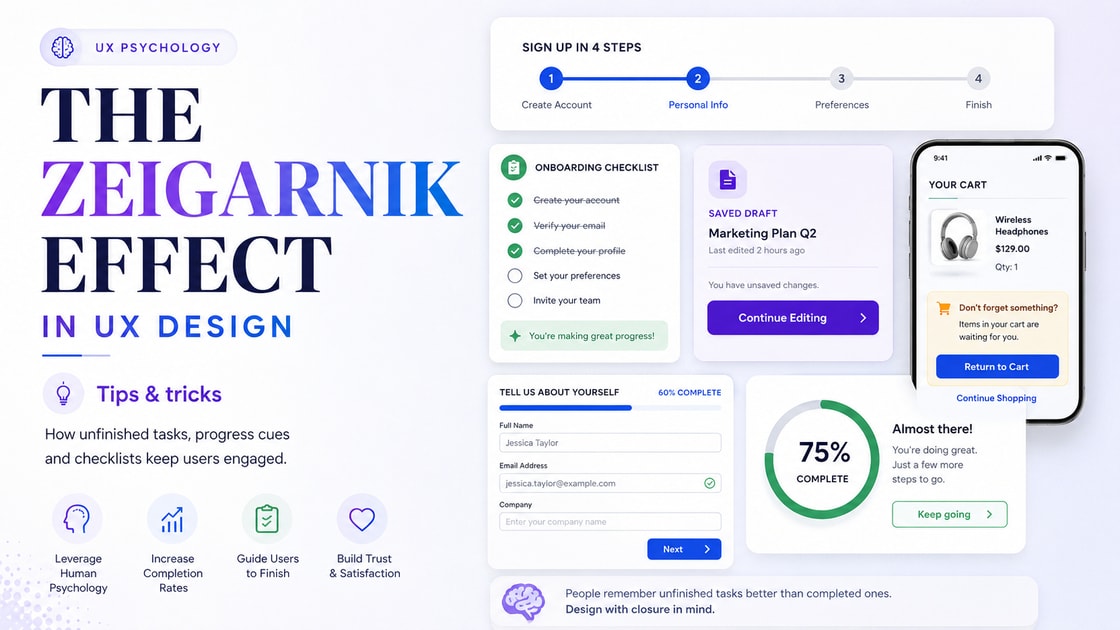
Web Design Tips and Tricks: The Zeigarnik Effect in UX Design
Some websites look good but fail to keep people moving. Others quietly guide users from one step to the next without feeling forceful. One reason this happens is psychology.
The Zeigarnik Effect is the idea that people tend to remember unfinished tasks more than completed ones. In web design, this matters because incomplete actions can create mental tension. Used properly, that tension can encourage users to return, continue, complete a form, finish onboarding, read the next section, or take the next step.
This does not mean trapping users or using pressure tactics. Good design should respect the user. The real value of the Zeigarnik Effect in UX design is that it helps you create clearer journeys, better progress cues, and more satisfying completion moments.
What Is the Zeigarnik Effect?
The Zeigarnik Effect comes from a simple observation: unfinished tasks often stay in the mind. A task that is incomplete feels open. A task that is completed feels closed.
In website design, this can show up in small ways.
A user may remember an unfinished form.
A shopper may return to an abandoned cart.
A reader may continue because the next section feels connected.
A dashboard user may come back because one setup step is still pending.
A learner may complete a course because progress is already visible.
This is why progress bars, checklists, saved carts, draft states, onboarding steps, profile completion prompts, and reminder messages can work so well.
They make unfinished actions visible.
Why the Zeigarnik Effect Matters in Web Design
Good websites reduce confusion. They show users where they are, what has been done, and what still needs attention.
When an unfinished task is presented clearly, users are more likely to complete it because the next step feels obvious.
The Zeigarnik Effect can help with:
- Increasing form completion
- Improving onboarding flows
- Encouraging users to return to saved items
- Making dashboards feel more useful
- Supporting ecommerce cart recovery
- Helping readers move through long content
- Making multi step processes feel manageable
- Giving users a sense of progress
The aim is not to create pressure. The aim is to make progress visible.
Use Progress Bars for Multi Step Forms
A long form can feel tiring if users do not know how much is left. A progress bar solves this problem by showing where the user is in the process.
For example, a quote form could be divided into:
- Project details
- Budget range
- Timeline
- Contact information
- Review and submit
When users see that they are on step 3 of 5, the form feels easier to finish.
Practical Tip
Avoid vague progress labels. Instead of simply showing a bar, add clear step names. Users should know what each stage means.
Good labels include:
- Your details
- Project type
- Requirements
- Budget
- Submit request
This makes the process feel structured rather than endless.
Show Incomplete Setup Tasks in Dashboards
Dashboards often fail because they show too much too early. A new user logs in and sees empty graphs, unused tabs, and unclear settings.
A better approach is to show an onboarding checklist.
For example:
| Task | Status |
|---|---|
| Add your business details | Completed |
| Connect your domain | Pending |
| Set up tracking | Pending |
| Invite a team member | Optional |
| Publish your first page | Pending |
This works because the user can see what is finished and what remains open.
When I design backend flows, I often think about this from a system level as well. A good backend should not only store whether a task is done. It should help the interface show the correct state clearly. Completed, pending, failed, saved as draft, and awaiting review should not all feel the same to the user.
Small status differences matter.
Use Saved Drafts to Bring Users Back
Saved drafts are a powerful way to use the Zeigarnik Effect without annoying users.
If someone starts a blog post, application, quote request, checkout, or account setup and leaves halfway through, the website can show a simple message when they return.
Example:
"Your draft is still saved. Continue where you left off."
This feels helpful because the user does not have to start again.
Saved drafts work well for:
- Application forms
- Checkout pages
- Custom quote forms
- Article editors
- Booking flows
- Account setup
- Client portals
- Report downloads
The important part is reliability. If you tell users their progress is saved, it must actually be saved.
Make Abandoned Carts Easier to Resume
In ecommerce, the Zeigarnik Effect is often seen in abandoned carts. A user adds items, gets distracted, and leaves.
A strong cart experience makes it easy to return.
Useful cart reminders include:
- Showing the cart item count
- Keeping cart items saved
- Displaying recently viewed products
- Sending a polite cart reminder email
- Showing a clear checkout button
- Avoiding unnecessary checkout steps
- Showing delivery and payment clarity early
Do not make the cart feel like a trap. Make it feel like a saved decision.
Use Checklists for User Motivation
Checklists work because they show visible progress. Each completed item creates a small sense of satisfaction, while the unfinished items keep the journey open.
Checklists are useful for:
- SaaS onboarding
- Profile completion
- Course progress
- Project setup
- Website launch steps
- Client onboarding
- Membership portals
- Account verification
A good checklist should not have too many items. If the list is too long, it becomes tiring. Keep it focused on the actions that matter most.
Practical Tip
Show the easiest first step near the top. Once users complete one item, they are more likely to continue.
For example:
- Add your name
- Upload your logo
- Choose your brand colour
- Connect your domain
- Publish your page
The first action should feel simple.
Break Long Content Into Open Loops
The Zeigarnik Effect can also help with blog content, landing pages, and educational pages.
A strong article does not simply dump information. It creates a reason to keep reading.
This can be done through open loops such as:
- Asking a useful question early
- Introducing a problem before solving it
- Previewing a practical method
- Showing what the reader will be able to do next
- Creating a clear section flow
For example, instead of starting with a generic introduction, a page could begin with:
"Most landing pages lose users not because the offer is weak, but because the next step is unclear."
That line creates a small gap. The reader wants to know what the unclear step is and how to fix it.
Use Incomplete Visual States
Incomplete states can guide users without using heavy copy.
Examples include:
- Empty profile photo circle
- Greyed out dashboard card
- Pending verification badge
- Progress ring around a task
- Partially filled completion bar
- Unchecked checklist item
- Draft label on unfinished content
These visual cues help users understand what needs attention.
The trick is to make incomplete states useful, not irritating. A pending item should feel like a clear next step, not a warning sign.
Give Users a Proper Completion Moment
The Zeigarnik Effect is not only about unfinished tasks. Completion matters too.
When a user completes something, the website should acknowledge it.
Completion moments can include:
- A success message
- A tick icon
- A progress bar reaching 100 percent
- A short confirmation screen
- A clean receipt page
- A completed badge
- A next step suggestion
This gives closure.
A weak completion state can make users unsure whether anything happened. A strong completion state makes the user feel finished, safe, and ready for the next action.
Use Gentle Reminders, Not Aggressive Prompts
Unfinished tasks can be useful, but they can also become annoying if handled badly.
Avoid reminders that feel too pushy.
Bad examples include:
- Constant popups
- Fake urgency
- Repeated notification banners
- Guilt based copy
- Blocking the user from browsing
- Hiding the close button
- Making incomplete tasks feel like errors
Good reminders feel calm and useful.
Better examples include:
- "You have 2 setup steps left"
- "Your draft is saved"
- "Continue your application"
- "Finish setting up your account"
- "Your cart is ready when you are"
The wording should feel like help, not pressure.
Apply the Zeigarnik Effect to Backend Logic
This is where design and backend thinking meet.
A good interface needs accurate states. The backend should know what has been started, saved, completed, skipped, failed, or abandoned.
Useful backend states include:
| State | Meaning |
|---|---|
| Draft | The user started but has not submitted |
| Pending | The task is waiting for completion |
| Completed | The action is finished |
| Failed | Something went wrong |
| Skipped | The user chose not to complete it |
| Expired | The action is no longer available |
| Awaiting review | The action is submitted but not final |
When these states are properly designed, the frontend can show better messages, better progress indicators, and better reminders.
I think about this often when building systems. A clean user experience usually depends on clean backend logic. If the backend does not know the real state of a task, the interface has to guess. That is where confusion starts.
Where to Use the Zeigarnik Effect
The Zeigarnik Effect can be useful across many website types.
| Website Type | Useful Application |
|---|---|
| Business website | Quote request progress |
| SaaS website | Onboarding checklist |
| Ecommerce store | Saved cart and checkout steps |
| Course platform | Lesson progress |
| Blog | Open loops between sections |
| Membership site | Profile completion |
| Client portal | Pending tasks and document uploads |
| Booking website | Step based reservation flow |
The principle stays the same: show what is open, what is done, and what comes next.
Practical Tricks You Can Use
Here are simple ways to use the Zeigarnik Effect in web design.
1. Add a Progress Bar to Long Forms
Users are more likely to finish a form when they can see how far they have come.
2. Save Drafts Automatically
Do not make users repeat work. Save partial progress where possible.
3. Use Clear Step Labels
Step 2 of 5 is useful. Step 2 of 5, Project Details is better.
4. Show Pending Tasks in Dashboards
Give users a short list of unfinished actions instead of leaving them to search.
5. Add a Completion Message
When a task is finished, show a clear success state.
6. Keep Cart Items Visible
If users add products to cart, make it easy to return and continue.
7. Use Checklists for Onboarding
A short checklist can make setup feel manageable.
8. Highlight Unfinished Profiles
Show what is missing without making the user feel criticised.
9. Use Open Loops in Content
Give readers a reason to continue from one section to the next.
10. Do Not Overuse Reminders
One useful prompt is better than five annoying ones.
Common Mistakes to Avoid
The Zeigarnik Effect should be used carefully. Too much unfinished tension can make a website feel stressful.
Avoid these mistakes:
- Showing too many pending tasks at once
- Using fake progress bars
- Making users complete unnecessary steps
- Sending too many reminder emails
- Treating optional tasks as urgent
- Hiding important controls behind progress gates
- Making the user feel trapped
- Showing progress that is not accurate
- Forgetting mobile users
- Creating a journey that never feels complete
Good UX gives users control. It does not chase them around the page.
Zeigarnik Effect and Mobile Design
Mobile screens need even more clarity. Users may be distracted, moving quickly, or switching between apps.
Useful mobile patterns include:
- Sticky progress indicators
- Short forms split into steps
- Save and continue buttons
- Clear tap feedback
- Cart reminders
- Draft recovery
- Simple completion screens
On mobile, keep unfinished task cues short. A small message can work better than a large banner.
Simple Checklist Before Publishing
Before using this principle on a website, review these points:
- Does the user know what they have started?
- Does the user know what is still unfinished?
- Is progress shown clearly?
- Is the next step easy to find?
- Are reminders helpful rather than irritating?
- Does the backend store task states properly?
- Is the completion state clear?
- Does the experience work well on mobile?
- Are optional tasks clearly marked?
- Does the journey feel respectful?
If the answer is yes, the design is likely using the Zeigarnik Effect in a useful way.
Final Thoughts
The Zeigarnik Effect is useful because it explains something simple: unfinished tasks stay in the mind.
In web design, that can help users complete forms, return to carts, finish onboarding, continue reading, or come back to saved work. The value is not in creating pressure. The value is in showing progress clearly.
When used well, the Zeigarnik Effect makes a website feel more thoughtful. Users know where they are, what is left, and what to do next.
That is good design. Not loud, not forced, just clear.